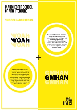
WOAH is an architectural collective aimed to address the homelessness crisis in Manchester.
The GMHAN is a network for everyone working to end homelessness in Greater Manchester through large scale events aimed at co-designing the homelessness policy and showcasing best practice.
To learn more about the collaborators you can visit their social media pages and website following the links below:
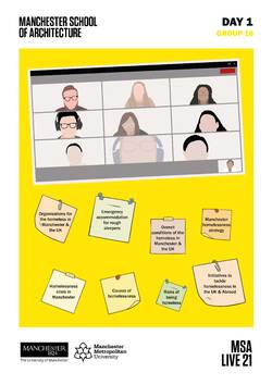
The day started off with the team spending some time getting to know each other. The members then worked on researching and collecting information about the homelessness situation in Manchester and the UK. Initial impressions of the project which was later presented to and discussed among the team. It gave us many ideas to work with for the rest of the week and helped get the project started.
We're looking forward to developing these ideas further over the next two weeks!
Posted 11 May 2021 19:26
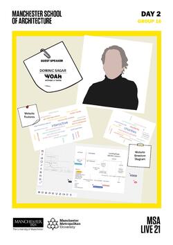
Group 16 is excited to share that our guest speaker for the day was Dominic Sagar from WOAH! Dominic gave us an insightful presentation on homelessness and various projects that tackle the issue, and an open discussion followed this. The presentation served as an excellent opportunity for the team to know about the homelessness issue in depth.
In the latter half of the day, the BA cohort studied some good and bad website design examples and developed a website structure diagram to form the foundation of the website's layout.
Posted 11 May 2021 20:41
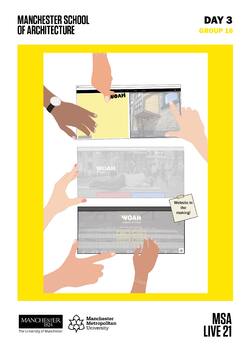
Day 3 started off with a tutorial on building a basic website on Wix, following which the first and second years were split into three teams to create a separate website. All the teams came up with fantastic layouts using the WOAH colour scheme, developing the ideas from Day 2. The day ended with a group discussion and reflection on the designs created so far.
Posted 13 May 2021 01:10
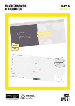
After confirming the website's layout on day 4, the team was split into two groups based on individual interests in web design and research. One group spent the day brainstorming the website's structure and hierarchy; the other group focused on building the site's landing page. Our website design firm came up with some great presentation ideas for the website, emphasising simplicity through design while incorporating WOAH's theme. The research team also drew mind maps to collate thoughts while simultaneously laying a solid foundation for the website.
Keep reading to see how we contribute to the final design by integrating these creative ideas into the final web design!
Posted 13 May 2021 20:23
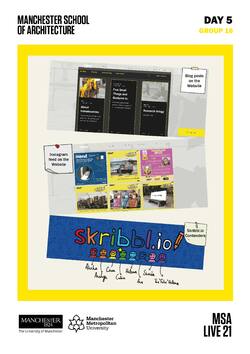
On day 5, the web design group began designing the rest of the website's layout and presentation. The research group had started updating the blog posts developing the ideas from the previous day.
After an intensive week of research and design, we decided to end the session with a fun game of Skribbl!
Posted 14 May 2021 20:17
Welcome to Week 2 with Group 16! This week is all about using the research information and content from the previous week and updating it on the WOAH Website. The goal is to publish the website by the end of this week.
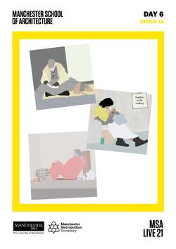
The team spent the day creating illustrations which will be combined with the research from last week and updated on the website.
Keep reading to see our progress into the final web design!
Posted 17 May 2021 22:07
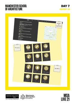
Today the team used the research from the last few days to create a graphical presentation of the information. Simultaneously, the website team updated the 'get help' section of the website. The BA cohort designed simple icons and symbols that are easy to understand, making it easier for the audience to read, interpret and absorb the information presented while elucidating the causes and effects of homelessness. The ability to present information in several different ways is a skill that will help to prepare a visually appealing final output.
Posted 18 May 2021 19:42
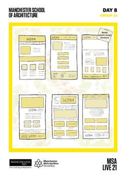
Today, the research team members were presented with a design challenge where each student had to come up with a layout for WOAH's mobile website that is designed and optimized for hand-held devices, such as smartphones and tablets. The students came up with impressive layouts for the mobile site, which is a great way to understand the design's key functionality before its implementation on the website. This design exercise enabled the students to share ideas and to receive critique to help refine their designs and learn from their peers.
Posted 19 May 2021 18:39
Today, our team spent all day putting the final website together. Stay tuned: Our new website is on its way! #WIP